There’s something about square photographs that warms the cockles of my heart. I’m not sure what it is. Perhaps it’s because I’ve been seeing landscape oriented photos for most of my life and I’m getting tired of them or maybe it’s because square photos just seem more artistic. Whatever the reason, I like the square format and that’s the way it is.
In today’s post, I’d like to talk about the affection I have for this specific style of photography and post-processing. I’ll discuss a few of the better reasons someone might feel the same way I do and I’ll also try to convince you to join along with our way of thinking. You may not know this about me, but I went through a “square photo” phase a few years ago. Every time I’d output an image, it’d be square. I can’t remember why I ever gave that one up. I also went through a phase where I used all caps when writing emails. I think I got away with that one twice before being asked to stop it. I don’t want to talk about that any more than I have to. We’ll leave that in the past.
Before I discuss my affection for square photos though, I’ll answer a few questions.
What is Square Photography?
The easy answer to this question would be to say that square photography is any photography that’s square. But that wouldn’t really be an answer at all. Basically, it all depends on the composition of the visual elements within the frame. Square photography emphasizes those elements, such as lines, textures, and shapes, within the composition. This type of photography also relies on tonal contrast for impact. To sum it up, you’ll know it when you see it. It’s any scene that would look and does look stellar in square format.
Who Were Some Famous Square Format Photographers?
One of the very first cameras to capture square format photos was produced by Rollei back in 1929. After that, Voigtländer and then Hasselblad produced their own cameras. Kodak made the square format Instamatic camera later on in the 50s as well. During the 20th century, many well known photographers, such as Richard Avedon, Irving Penn, Robert Doisneau, and Diane Arbus, have taken advantage of the format.
How Can You Shoot Square Photos?
Check your camera’s settings. I own a Canon Rebel T7i DSLR camera and there are settings for various aspect ratios in the menu area. One of those formats is 1:1, which is square. More realistically though, I find that shooting in 4:3 ratio is the best and then cropping to square during post processing later on makes life much easier. For many, the square format is extremely confining and they find it less stressful to crop after the fact (when they have more room).
Square Creates an Interesting Composition
I want you to do a mental exercise for me for a moment. Pretend that you just spent a few minutes looking through a collection of entirely square photographs. Let’s say ten minutes. Now, pretend that someone showed you a landscape oriented photo. What would you think? I can tell you that I’d be like, “What is that? I like the square ones better.” The mind gets used to certain things and symmetry is one of them. I’m not saying that photos that are comprised of other dimensions are any better or worse, I’m just saying that square has a place among them all.
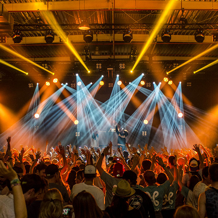
Take a look at this photo.

Pretty cool, right? I cropped this shape from a landscape photo because I thought the square would envelop the scene better. That it would “hug” the lights coming from above the stage. I also wanted to remove any elements in the photo that I didn’t think were important or that I thought might detract from the primary focus. I think I succeeded because the image looks great with the dimensions I applied. This technique is especially appealing when there’s a single element in a photo, such as a flower or other similar object.
Black & White Framed Photos
A few months ago, I went to an art sale at Sugarloaf Mountain in Maine. Whenever I go to these types of events, I expect to see some astonishing art and I usually do. Much of it comes in the form of photography. A ton of it is comprised of photos taken right in the area. After all, the art is sold in the state and I’m not sure why someone would be selling photos of mountains in Wyoming when Maine mountains are a favorite of Mainers. As I was browsing around, I found that nothing struck my fancy. That is, until I saw a gentleman selling black and white images. I have to say, I was blown away by what he had for sale. They were all in frames and they were hanging on the wall. Many of them were perfectly square. I’ll never forget the impact those square framed photos had on me. That’s probably why I’m mentioning this right now.

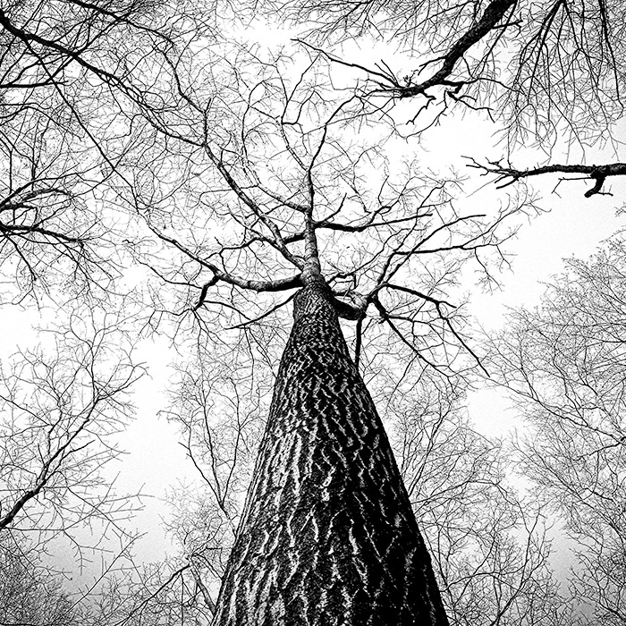
The square shape can truly come alive when it’s applied to black and white images. Again, it removes the fluff and allows for the focus to be directed at the subject. If you’d like to see some stunning black and white square photography, check out Michael Kenna and Hengki Koentjoro’s work.
Square Exudes Feeling
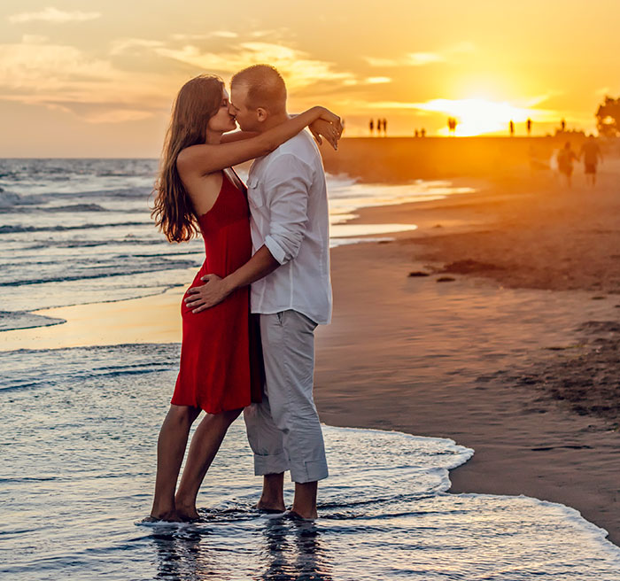
Regular landscape and portrait photos are fine and I find it challenging to argue against either of these formats, but I do want to say that under certain circumstances, square photos can handle situations just a little bit better. Take a look at this next image. I cropped it from a landscape photo and the moment I did, I realized that I had made the correct decision.

In the original image, there were distractions off to the right side. Those distractions made my eyes wander around and lose focus of the obvious subjects of the image. The moment I removed the sides of the image, the scene tightened on the couple and I had no choice but to consider what was happening.
In my opinion, square images can bring out the meaning behind a photograph. It can force a focus and the “squareness” of things can completely change the way a viewer perceives what they’re looking at.
Social Media & Instagram
One hundred bajillion people can’t be wrong. Just look at Instagram. Almost every image displayed on Instagram (I suppose that’s changing now) is square and people seem to love it. I will mention one issue with this though. With this blog and others that I own and manage, I find that when I upload a post related image to social media that isn’t square, the results can be somewhat unpredictable. Sometimes things are cut off that are meant to be in the photo and sometimes things just don’t look right. I’ve actually begun cropping photos that I intend to upload to my social media accounts to counter this unpredictability. At times, I go fully square and things work out wonderfully. I actually like it better this way because I don’t need to concern myself with how the format is going to end up. I already know how it will. Of course, square may play second fiddle to another format one day, but I’ll enjoy it until then.
Here’s a question: What’s your favorite shape for photos?
I hope I clearly offered some new perspective to a different type of shape when it comes to photography. If you have anything you’d like to add, please do so down in the comment section below. Thanks for reading!

I’m curious as to what other photographers think about this topic. I personally take tons of portrait shots, so I obviously have a liking for taller, rather than wider images, but I can definitely see other orientations that are appealing. For instance, if I were to capture some photos of a tall tree, I’d want that to be a taller photo, just like the tree. But if I were taking photos of a mountain range or something that has a natural orientation or being wide, I’d definitely want a wider, more landscape image.
What’s your take on this and why? What orientation do you prefer for your own photography? Wide? Tall? Square? Someplace in between?
Square is awesome. I love it. You really need to check out Michael Kenna. Most of his photography is in black and white and most of it is square. He loves landscape, but shoots a lot of other styles as well.
That’s a good question. I’m actually starting to move towards square photography because I like the way it looks as well as the way it’s been progressing online. I actually don’t even know the reason why photographs have traditionally been captured as a rectangle.
I obviously like wide landscapes and tall portraits, but square seems to fit for many of my photos these days. And as far as Instagram goes, since that’s the format that’s shown, that’s what I give them because there won’t be any surprised when I post to them.
Square is also good because it’s still in the “new” stage. If you look around, you’ll see that most photography still has either a landscape or a portrait orientation. Square is the new kid on the block and it’s exciting.
Lastly, I think square photos can truly capture what the photographer was after when it comes to certain shoots and situations. These photos cut out what’s not needed in the shot and show only what is. There’s a lot that can be said about that as far as composition and mood are concerned.
Anyone else?